The UNMC CMS implementation leverages components as the primary method for creating and managing content.
This section explains the different types of components and panels available for tertiary pages.
No more than two sidebar components should be used per page.
Jump to Section
- Body Content
- Split Column
- Testimonial
- Feature
- Block Grid
- People Listing
- Inline Images
- Intruder Image
- Video Embed
- Slideshow
- Resource Panel
- Accordion
- Table
- Tabs
- News Feed (Sidebar)
- Events Feed (Sidebar)
- Sidebar Feature (Sidebar)
- Contact Card (Sidebar)
Body Content
The Body Content component provides a range of standard typographic options for presenting text on tertiary pages.
Split Column
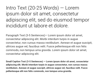
The Split Column places text in a two-column layout. Side-by-side content is a great way to distinguish different sets of information without adding to the length of the page.

Testimonial
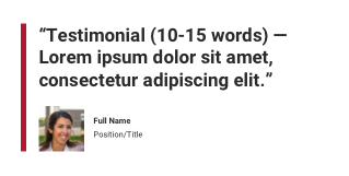
Use the Testimonial to feature an impactful quote from students, faculty, alumni or other relevant sources. It consists of quote text that would ideally be 10-15 words in length, a thumbnail image (83x83px) and attribution fields for name and title.
Feature
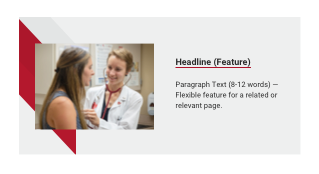
The Feature is used to preview a story, program, profile, activity or initiative that supports the page content. It includes a linked headline, paragraph text and image (900x600px). Content editors can choose between left and right layouts, allowing multiple features to be stacked.
Block Grid
The Block Grid places images with short paragraphs side-by-side in two-column or three-column format. Use it to highlight key points on a page and distinguish different sets of information. It offers flexibility to include an image (900x600px), optional caption, heading, brief paragraph text, and optional call to action link on each block.

People Listing
The People Listing is used to display multiple contacts on a page. Each contact consists of a heading, multiple title fields, email, phone and fax details. Three layouts are available: One-column layout with the option of using photos (900x600px); two-column layout without the option photos; and a three-column option with the option of using photos (900x600px). Contacts can be manually added or imported from an existing faculty bio page. Importing from faculty bio pages is preferred so that updates are made automatically. An alternative is available for the use of vertical photos placed on a gray background only for listings of students, residents, fellows or non-UNMC speakers and collaborators. Instructions for this option are found in the Knowledge Base. This option is not allowed for UNMC faculty and staff photos.
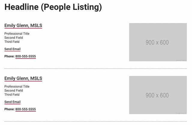
Inline Images
Incorporate Inline Images into long-form copy to complement, underscore or amplify your text. With support for images and image captions, this component works well for articles, event recaps and stories.
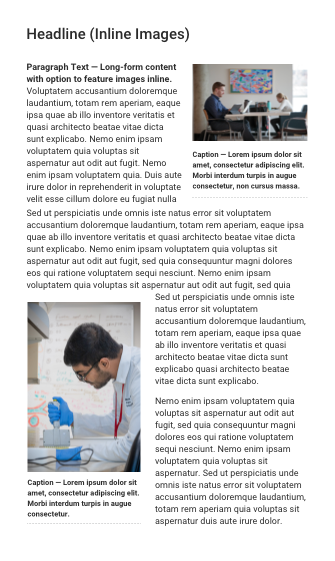
Intruder Image
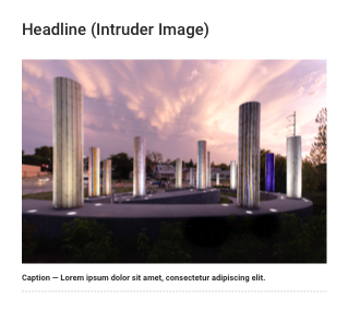
Use the Intruder Image (900x600px) to offer relevant visuals to the user between blocks of text. This image spans the full width of the main column and includes a caption.
Video Embed
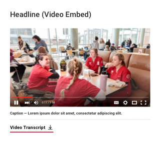
Use the Video Embed to showcase a supporting video on a page. This component includes an in-line video player (meaning the video will play without launching a lightbox modal), a caption, and a link to a video transcript if one is available.
Slideshow
The Slideshow houses a series of photos (900x600px), each with a unique caption. It’s useful for showing campus photos, facilities and event recaps. With left and right arrows and a progress indicator, site visitors can browse images without needing to scroll down the page.

Resource Panel
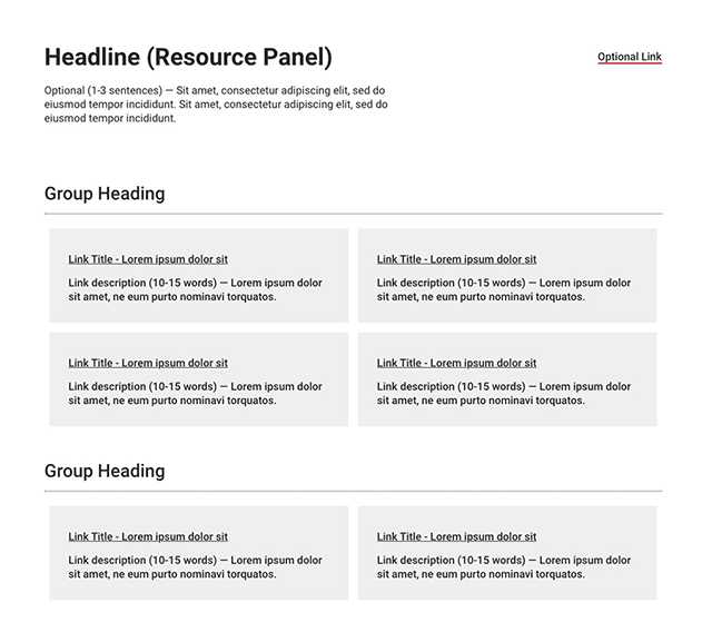
The Resource Panel supports a headline, optional paragraph text and a component-level link. Use it to display large lists of links that you want to break up into groups. Each group has its own heading while each link includes a place for description text and is displayed as a grey box.
Accordion
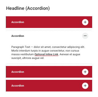
The Accordion presents short amounts of text on related topics in a condensed format. Examples include FAQs, biographical information and step-by-step processes. Each accordion section consists of a heading and supporting content once expanded. Each accordion section may contain one to three short paragraphs of text or bulleted lists of about six items (up to about 12 if split into two columns).Keep the text within a single accordion as succinct as possible. If you find accordions contain multiple paragraphs of text, the content should be trimmed down, split into separate accordion sections or moved to a body content component. Accordions may not contain photos, headlines, tables or other graphic elements.
Table
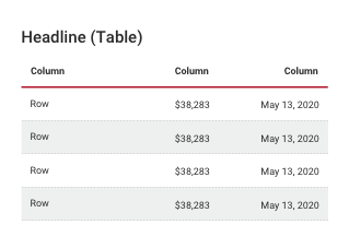
The Table organizes sets of data in an easily digestible format. It consists of columns and column headings, rows and row headings, and fields for corresponding data.
Tabs
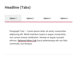
Use Tabs to present related content in a condensed format. This component consists of a set of navigable tabs across the top and supporting content per tab. [Each tab has a heading and supports text and links within each tab.] With a small area for tab headings, this component works well for succinct and uniform sets of information, such as steps (Step 1, Step 2…) or timelines (Week 1, Week 2…). To ensure each tab label is readable, use a maximum of four tabs.
News Feed (Sidebar)
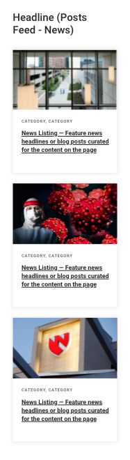
The News Feed component incorporates relevant news headlines on a page. Each card features an image (900x600px), category tags and a linked headline. The news items may be curated or be added through a feed. To find a feed URL, view our available tags page.
Events Feed (Sidebar)
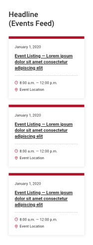
The Events Feed component incorporates relevant upcoming events on a page. Each card features the event date, a linked headline, event time and location. The event items may be curated or be added through a feed.
Sidebar Feature (Sidebar)
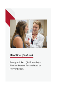
The Sidebar Feature previews a story, program, profile, activity or initiative that supports the page content. It includes a linked headline, paragraph text and image (900x600px).
Contact Card (Sidebar)
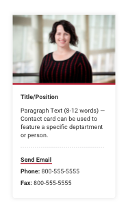
The Contact Card highlights a main point of contact, be it an individual or department/office. The card consists of a photo (900x600px), heading, supporting open-ended text and fields for email, phone and fax details.