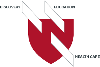
The University of Nebraska Medical Center “frame” is a visual design element that extends the themes of education, discovery and health care from the emblem to other applications. The repeated use of the shape builds upon our brand’s visual language.
Usage
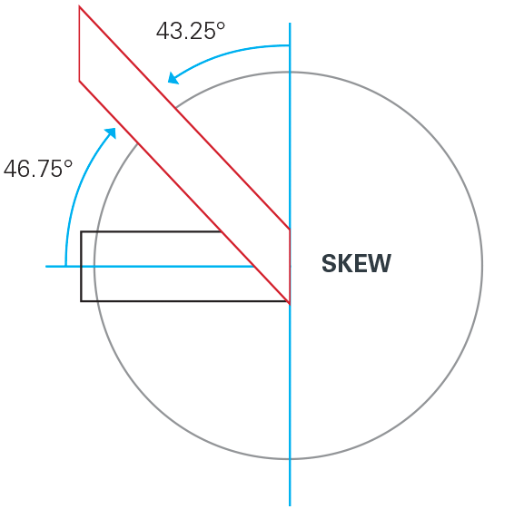
Based off the angles incorporated into the emblem, frames should always be used at the same angle. It should not be rotated or shown with perspective except in animated applications. A frame is a parallelogram, created by skewing a rectangle and keeping opposite sides of the shape parallel.
Arrangements

Overlapping Shapes
Multiplied frames can be arranged and overlapped to create a layered effect.
Side Bar / Logo Frame
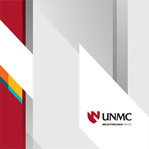
Side bars can be utilized when content covers most of the space. A logo frame can be used to house the logo when it doesn’t interfere with other elements.

Side Bar with Imagery
Side bars can also be applied to the left or right side of a layout that includes a large image.
Secondary Color Frames
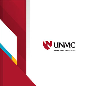
Frames filled with secondary colors can be added sparingly to create interest and uniqueness among items in a series. For instance, a series of brochures could fill the secondary color frames with different colors for each piece.
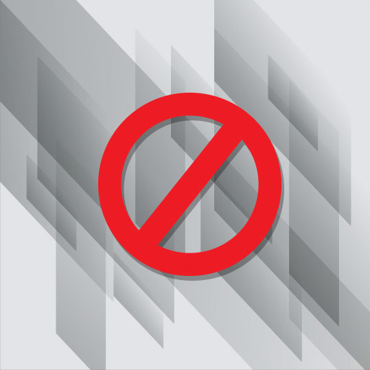
Don't Overapply Frames
Applying and overlapping too many frames can create a chaotic look that doesn’t speak to the personality of UNMC. Less is more.
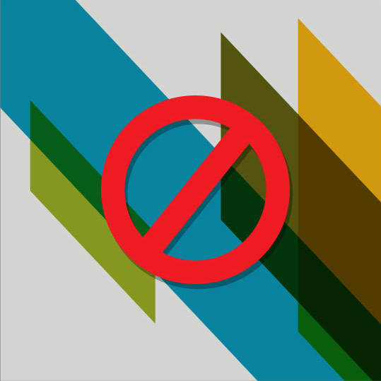
Don't Overuse Color
The majority of each composition should be red, black and white. Too much color can detract from brand recognition and communicate too much playfulness and excitement.