College and Landing Page Components
The UNMC CMS implementation leverages components as the primary method for creating and managing content. This section explains the different types of components and panels available for the college and landing page templates.
Hero
The Hero component is used to create the first section of a full-width page. It contains a full-width image and space for a two-line headline (h1) contained within a UNMC-red branded “frame.” The hero image sizes are 1600×800 and 800×800 (for mobile).

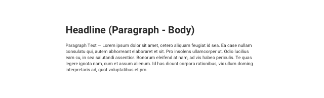
Body Content
The Body Content component provides a range of standard typographic options for presenting text on full-width pages.
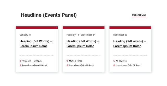
Events Panel
The Events Panel is a dynamic component that displays a feed of coming events on the page. Each card contains the event date or range of dates, a single headline link, event time and location. The Events Panel does not support images. An optional link is available at the panel level for “All Events” or a link to related content. The event items may be curated or be added through a feed.
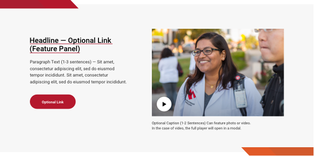
Feature Panel
The Feature Panel is used to preview a story, program, profile, activity or initiative that supports the page content. It includes a headline with an optional link, paragraph text, an optional call to action (CTA), image (900x600px) and caption. The image can also be used to launch a light-boxed modal video presentation. Content editors can choose between left and right layouts, allowing multiple features to be stacked. Note: Editors may choose either to link the headline or use a CTA, but not both.
Stats Panel
The Stats Panel is used to present facts and figures related to page content. It supports a headline, intro text, and three large statistics with supporting text.

Router Panel
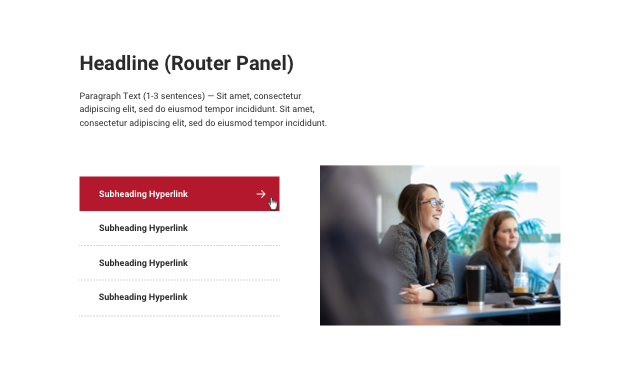
The Router Panel is one of two components used to present a list of related links. It can be used to complement a page as pathways to important information. The router panel supports a single headline, paragraph text, a single image (900x600px) and up to four links. Use this panel when one image will suffice to describe the group of links.
Router Grid
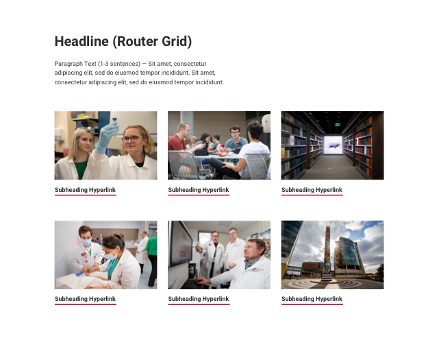
The Router Grid is the second of two components used to present a list of related links. Use the Router Grid when images are needed to support each link and a more visual presentation will be helpful for visitors. The component supports a headline, paragraph text and up to six links, each with an image (900x600px).
Call to Action
The Call to Action is a simple feature to highlight up to three actions for visitors to the page. Use towards the bottom of the page layout to encourage visitors to explore, complete next steps, apply, visit or request information. This component supports a single headline and up to three standard UNMC-red buttons.

News Panel
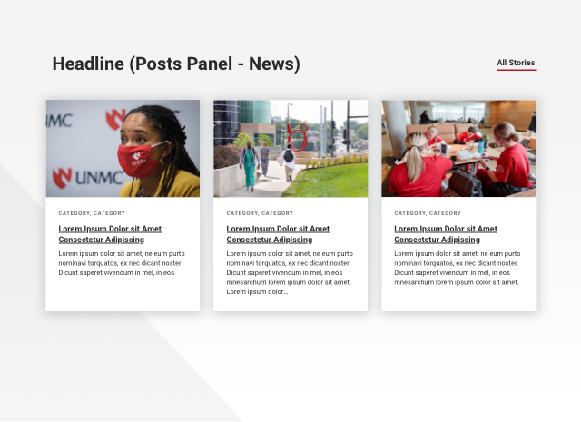
The News Panel supports a headline and an “All Stories” link. It houses three news or story cards. Each card contains an image (900x600px), category tags, multi-line linked story headings and paragraph text. The image should support the post and is required for each card. Headlines route visitors to the full text on either a tertiary page or a story page. The news items may be curated or be added through a feed. To find a feed URL, view our available tags page.
News Grid
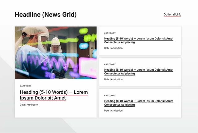
The News Grid supports a headline and an optional link. It contains one main news item and three regular news items. All news items include a headline, category tags, date and author field, while the main news item includes an image (900x600px). Each headline will link off to the full article/story. The news items may be curated or be added through a feed. To find a feed URL, view our available tags page.
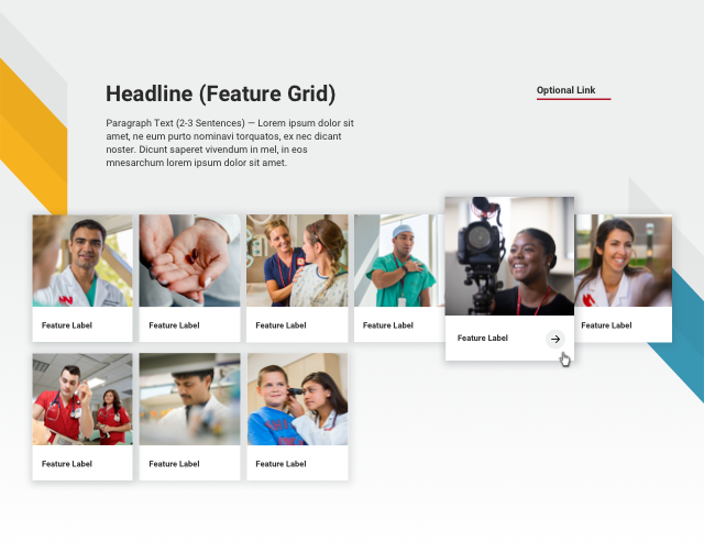
Feature Grid
The Feature Grid, like the Router Grid supports a headline, paragraph text, and image-based (600x600px) routing. It also supports a component-level link. Use the Feature Grid for college routing or research areas listings.
Feature Media
The Feature Media block is used to display a single, high-quality image (900x600px) or video. If a Youtube or Vimeo video is included, a play button will display in the bottom right corner of the image. It also supports a caption and an optional link located below the image.

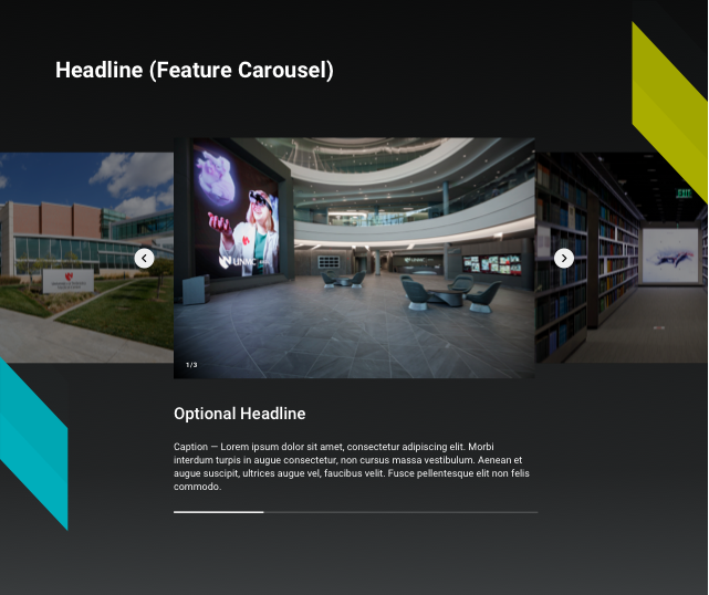
Feature Carousel
Use the Feature Carousel for high-quality slideshows. For example, a collection of images (900x600px) that describe a place, showcase a technology or tell a visual story. For the best user experience, choose three to five images total. Images are always displayed on a dark grey background to aid in the perception of a brighter more dynamic image. Each image supports a caption. Captions are important for site visitors of all abilities and backgrounds to understand what a photo is showing.
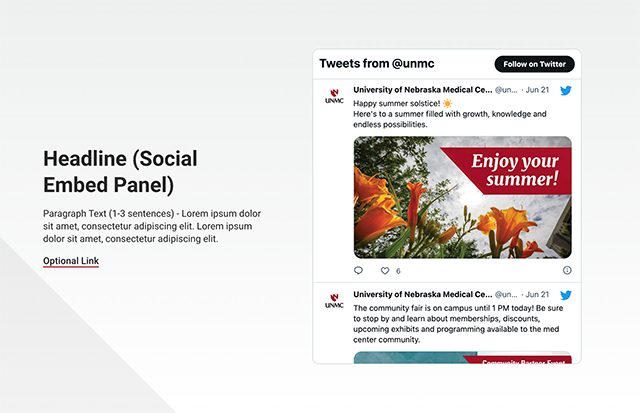
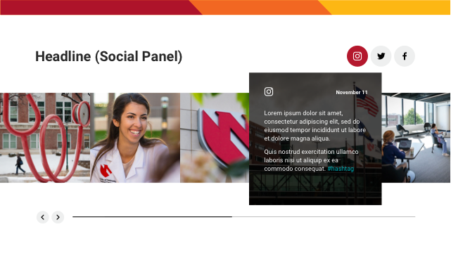
Social Embed Panel
The Social Embed Panel is used to display a Twitter feed, Facebook timeline or Instagram profile. It supports a headline, paragraph text and an optional link. Only use one on a page.
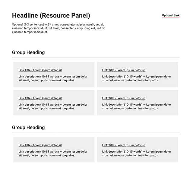
Resource Panel
The Resource Panel supports a headline, optional paragraph text and a component-level link. Use it to display large lists of links that you want to break up into groups. Each group has its own heading while each link includes a place for description text and is displayed as a grey box.
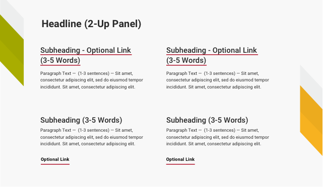
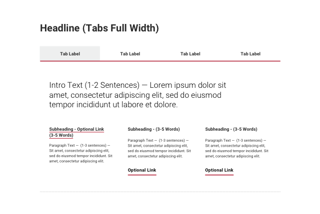
2-up Panel
The 2-up Panel places short paragraphs side-by-side in two-column format. Use it to highlight key points on a page and distinguish different sets of information. It offers flexibility to include headings on each column and add any relevant links.
3-up Panel
The 3-up Panel places short paragraphs side-by-side in three-column format. Use it to highlight key points on a page and distinguish different sets of information. It offers flexibility to include headings on each column and add any relevant links.
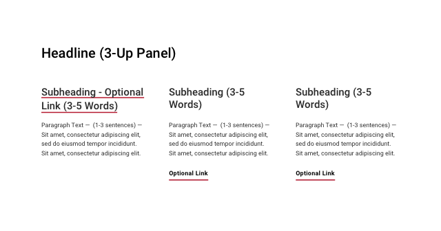
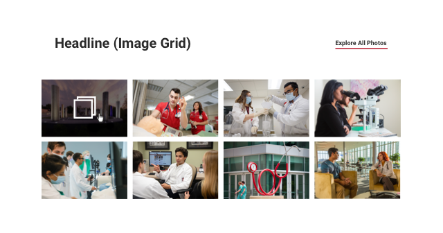
Image Grid
The Image Grid displays a gallery of images (900x600px). Visitors can click on an image to view a light-boxed sequenced slideshow of images with captions. The Image Grid should be used as an alternative to the Feature Carousel when it is important to display a thumbnail preview of each image.
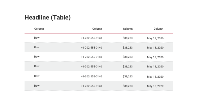
Table
The Table is used to organize sets of data in an easily digestible format. It consists of columns and column headings, rows and row headings, and fields for corresponding data.
Tabs
Use Tabs to present related content in a condensed format. Each tab has a heading and supports text and links within each tab. With a small area for tab headings, this component works well for succinct and uniform sets of information, such as steps (Step 1, Step 2…) or timelines (Week 1, Week 2…). To ensure each tab label is readable, use a maximum of four tabs.
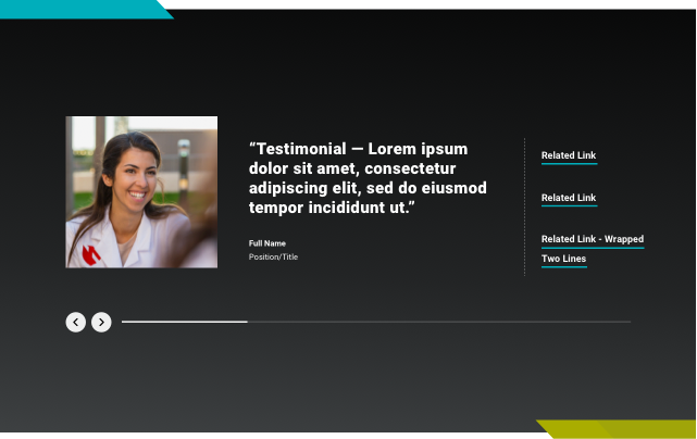
Testimonial
A carousel of Testimonials is used to feature an impactful quote from students, faculty, alumni or other relevant sources. It consists of quote text, an image (600x600px) and attribution fields for name and title. Use the optional link list to help visitors find related content. The maximum recommended length for the quote is 120 characters.
Social Slider
This block is currently only available on the UNMC homepage template. The curated social feed supports Instagram, Twitter and Facebook. Social usage should adhere to UNMC’s social media policy.
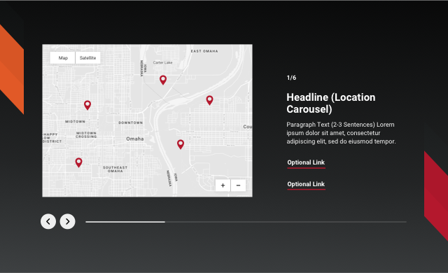
Location Carousel
The Location Carousel uses Google Maps to help visitors explore UNMC locations. Visitors can advance the slide or click on a location pin to read more. Each slide supports a Google map, a headline, body text and up to two links for related content.