Visual Design
UNMC’s website design follows visual identity guidelines established by the Department of Strategic Communications. Familiar user interface elements and common patterns complement existing brand elements. Together our established brand and modern web design practices along with stringent accessibility standards support an excellent user experience for all audiences.
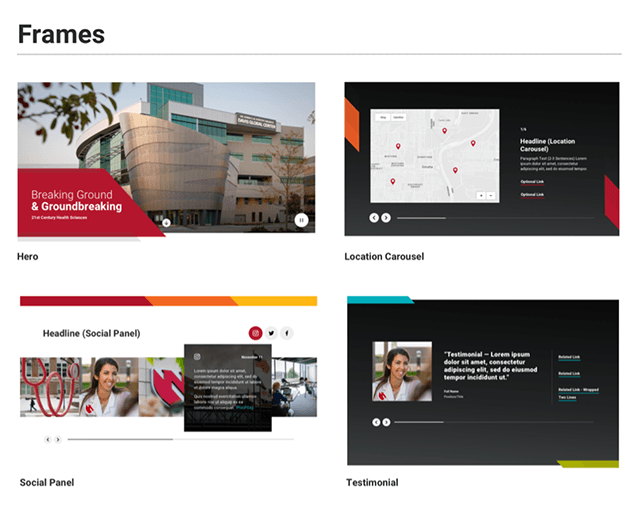
Brand "Frames"
The “frames” design motif is used consistantly across UNMC’s marketing collateral, internal presentations, and campus environment. The repeated use of the shape on the website reinforces our our brand’s visual language. Where appropriate, motion is used to bring this element to life. For a definition, see Frames.
Color
UNMC’s red, white, black and gray are the primary colors used on the web. Secondary colors include accessible applications of blue, green, yellow and orange. The secondary palette adds vibrancy to the web design. In limited cases, the secondary colors are used to distinguish sub-sites.

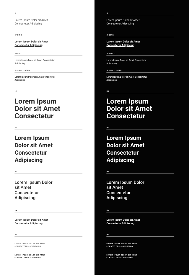
Typography
Roboto is our brand typeface for headlines, body copy and UI labels — replacing Univers in all digital applications. It is an open-source Google font designed specifically for screens. It’s widely regarded as a legible web font and works well at a variety of sizes, weights and screen resolutions. As a sans-serif font, Roboto uses simplified characters that appear easier to read for users with dyslexia and other visual impairments.
Iconography
A collection of high-quality icons have been selected for discrete use on UNMC’s homepage “stats panel” and on the program page “program snapshot panel.” Icons should not be used beyond these select panels.

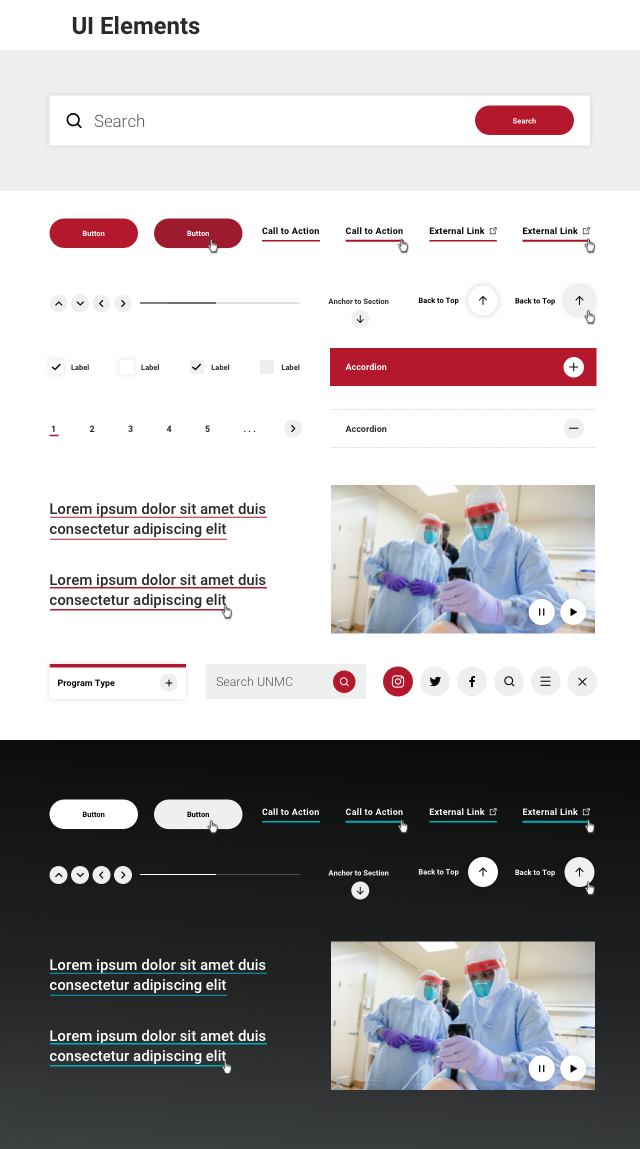
User Interface Elements
“Call to action” buttons, links, arrows, menu icons, sliders, play buttons, image and video controls employ accessibility best practices and are based on familiar patterns. The website’s UI aesthetics complement UNMC’s brand while providing a smooth user experience.